
International travel in a pandemic: what does UK data tell us?
Travel restrictions, as well as testing and quarantine requirements, have stifled international travel during the COVID-19 pandemic. The UK government’s traffic light system, which was originally welcomed by many, has led to confusion and frustration in the industry and among passengers. The UK government has recently published more detail on the factors driving its decisions and new data on traveller numbers and prevalence. What can we learn from this data?
On 9 April 2021, the UK government published the Global Travel Taskforce report, which set out how international travel could reopen safely. It recommended removing the ban on outbound travel from 17 May and implementing a traffic light system whereby different restrictions are applied to different countries depending on the levels of risk that travel to and from such countries pose, with countries classified as green, amber or red.
The initial lists were published on 7 May. With only 12 countries on the green list, including Singapore and Australia that are generally not accepting UK citizens, there was significant disappointment among passengers. However, the inclusion of Portugal on the green list, and the hope that other countries would be added after a review of the list in three weeks’ time, gave many hope that summer travel would still be a possibility.
Last week, the UK government announced that, not only would no countries be added to the green list, but Portugal would be removed and placed on the amber list. At a time when COVID-19 prevalence rates are plummeting and vaccination rates are rising across a number of countries, this has led many to question whether the traffic light system will lead to the reopening of international travel as promised. At the same time, the delays in moving India onto the red list has led some to question whether the policy actually works at all.
While passengers and the aviation industry were attentively awaiting last week’s update for signs of a soon-to-come return to normal, new data published by the UK government to support its decisions has gone largely unnoticed. This includes data on the number of international travellers tested, how many tested positive for COVID-19, and how many variants have been detected. Below, we look at this data in more detail.
Travel does not seem to be picking up
After an all-time peak in December 2020, COVID-19 prevalence in the UK has been decreasing since the start of the year. Corresponding to a significant reduction in hospitalisations and deaths (first due to lockdown, and then vaccination), the UK government announced a roadmap to end restrictions on 22 February. Some first steps included allowing Brits to travel outside of their local areas in late March. The first measures regarding international travel were announced on 9 April, when a new international travel policy, setting out the traffic light system, was published by the Global Travel Taskforce.
Figure 1 Estimated average COVID-19 prevalence in the UK population and changes to travel policy in the UK
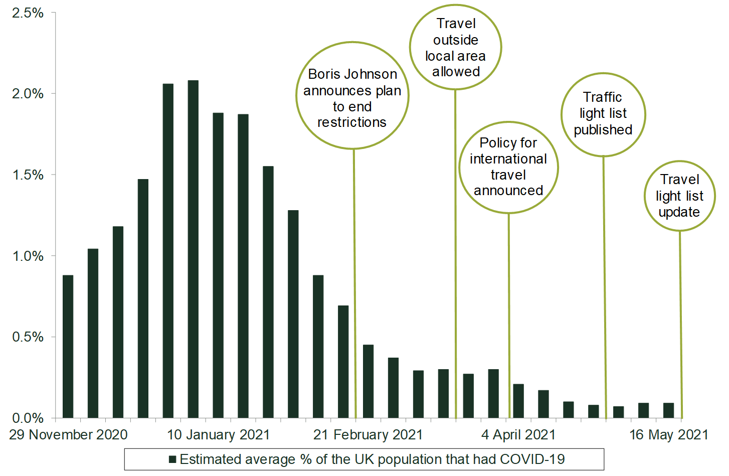
The first list allocating countries to different categories was published on 7 May. It put 12 countries on the green list and a number of countries on the amber list, easing restrictions for travel from these countries to a certain degree.
Explaining the UK traffic light system
As part of the UK traffic light system, countries are rated as red, amber or green. Passengers arriving from all countries must take a COVID-19 test in the 72 hours before travelling to the UK, but the rating affects the rules that passengers must follow once they arrive in the UK. These rules apply regardless of an individual’s vaccination status.
- Red countries: passengers travelling from red countries are only allowed to enter the UK if they are British or Irish nationals, or if they have residence rights in the UK. On arrival in England, these passengers must quarantine in a managed hotel and take two COVID-19 tests.
- Amber countries: passengers travelling from amber countries must quarantine at home for ten days and take two COVID-19 tests on days 2 and 8. Passengers can take an additional test at day 5 and be released early from quarantine if they receive a negative test result.
- Green countries: passengers arriving from green countries must take a test on day 2 after arriving, but they do not need to quarantine unless the test is positive.
Source: UK government (2021), ‘Guidance: Red, amber and green list rules for entering England’, 7 May.
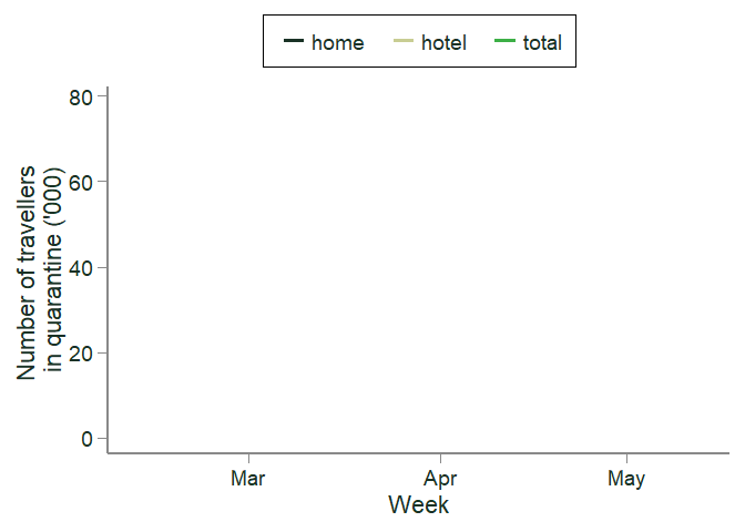
Despite a falling number of cases and progressive lifting of domestic restrictions, international traveller volumes to England—based on the number of travellers in quarantine—have not grown over the last few months. Figure 2 shows the weekly number of travellers starting their home and hotel quarantine between 11 February and 13 May 2021. As can be seen, the number of travellers starting quarantine has been declining since the week of 4 March. Although this data does not directly measure international arrivals to England, the number of international travellers should be highly correlated with the number of individuals starting quarantine as the vast majority of international arrivals have been required to quarantine over this time period.
Figure 2 Number of travellers starting home and hotel quarantine: weekly values, 11 February–13 May 2021
There are a number of reasons why international travel may not pick up for some time. Firstly, there may be a time lag—once restrictions are lifted, people still need to book their travel and accommodation, so we would expect a lag between when restrictions are removed and when we see an increase in traveller numbers. There is also an interaction with the restrictions in place in other countries. If restrictions in other countries are not lifted at the same time as those in the UK, travellers might be discouraged from travelling due to quarantine/testing restrictions in place there, or restrictions on entering altogether. The limited number of countries on the green list and concern as well as confusion about countries moving on/off the different lists is also likely to contribute to continued dampened travel, perhaps indicating that we are unlikely to see significant increases in travel over the next few weeks or even months if the current system remains in place.
What does the data tell us about the number of passengers infected with COVID-19?
The government’s decisions about which countries are included on the green, amber and red lists are informed by a risk assessment undertaken by the Joint Biosecurity Centre (JBC). The JBC states that countries are assumed to be amber unless they present a low public health risk to the UK from all COVID-19 strains (in which case they are green) or present a high risk to the UK from Variants of Concern (‘VOCs’), known high-risk Variants Under Investigation (‘VUIs’), or high prevalence (in which case they are red).1 As part of its assessment, the JBC looks at a number of factors for each country, including test positivity, incidence rates, testing rates and genomic sequencing capability. However, the JBC has not published any further detail on how it takes these factors into account or the thresholds used.
The UK government publishes biweekly data on the number of travellers tested, the number of travellers infected with COVID-19 (‘positivity rate’), and the number of travellers infected with one of the Variants of Concern. The data is reported by country of origin and applies to travellers arriving in England only.
The animated chart below shows how traveller numbers (measured by travellers tested) and prevalence rates have changed between 25 March and 6 May 2021. Each bubble represents one country at a point in time. The size of the bubble shows the number of travellers from a given country. The larger the bubble, the more passengers arrived in England at that point in time.
Figure 3 The number of passengers arriving in England who are tested and corresponding positivity rate by country, 25 March–6 May 2021
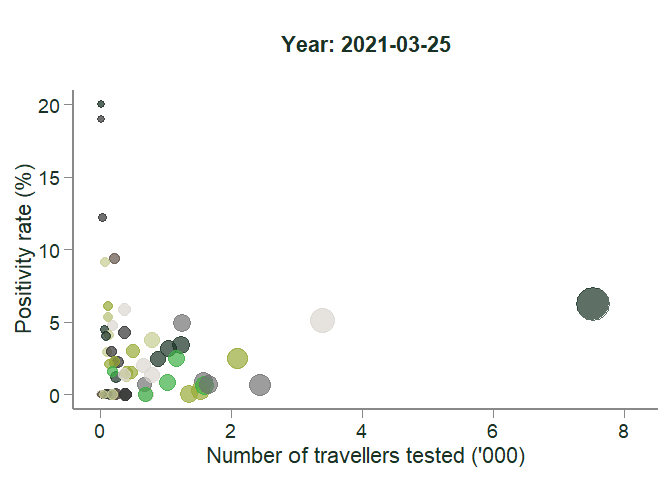
In line with Figure 2 above, the chart shows that traveller figures for most countries are very small—i.e. only a handful of travellers arrived at airports/ports in England from most countries. This means that positivity rates need to be taken with a pinch of salt: the sample size might not be large enough to be representative. This also explains why the points to the left of the figure—those with very low traveller figures—have a greater variance in positivity rates over time. This is not necessarily reflective of infection rates in the underlying populations, but might be due to the small sample sizes.
The bubbles to the right, which represent the countries from which more travellers arrived in England, have more stable positivity rates. One example is Pakistan, represented by the dark green bubble to the far right of the chart. This is the country from which the most travellers arrived in England between late February and mid-April 2021. Pakistan was added to the red list on 9 April, after which traveller numbers declined sharply.
Travellers from red countries are not necessarily more likely to be infected with COVID-19 than travellers from some amber countries
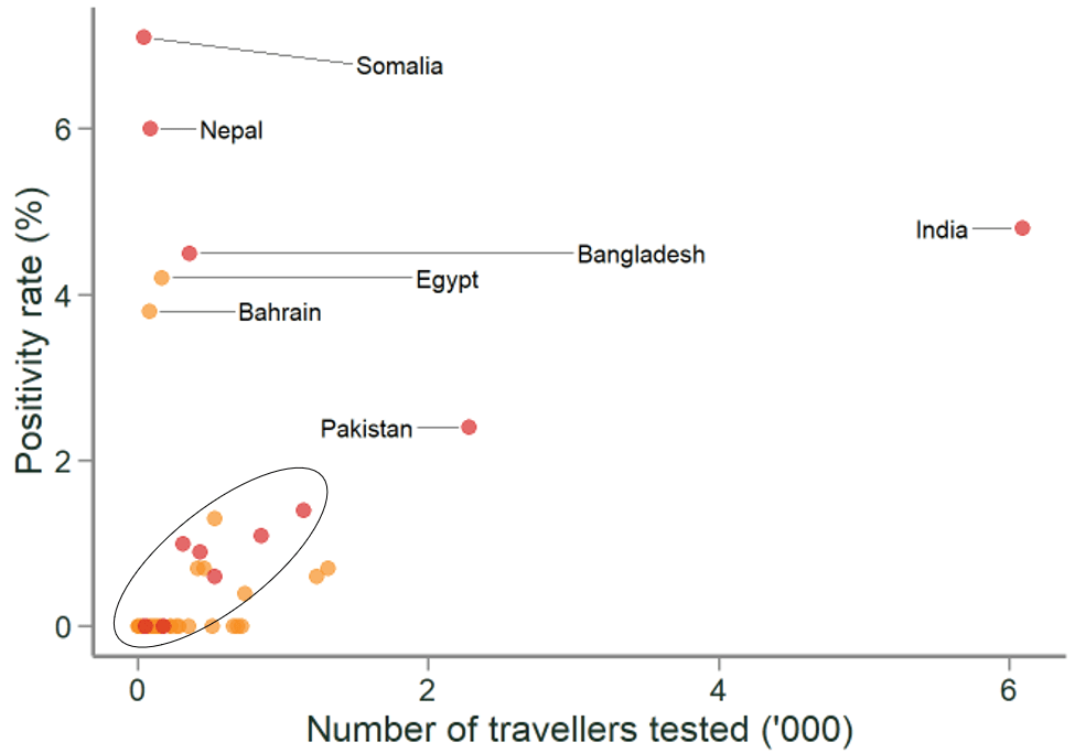
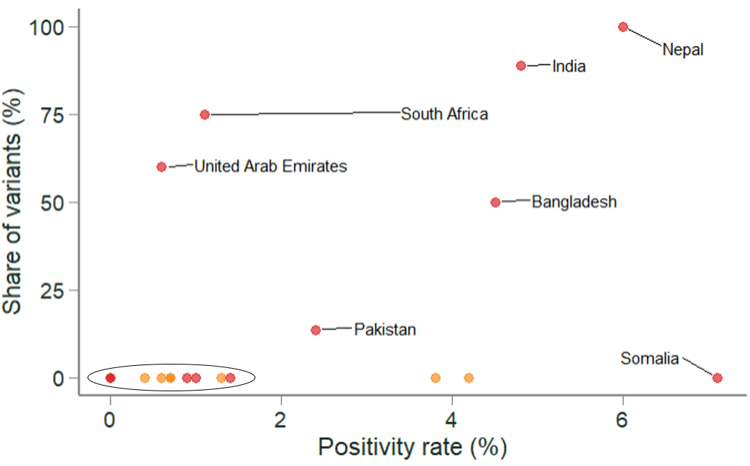
Figure 4 shows the latest available data on traveller prevalence rates covering 6–19 May 2021. Each dot represents one of the 216 red and amber countries based on the traffic light system lists in place at the time.
Figure 4 Variation in red and amber country traveller prevalence, 6–19 May 2021
Source: Oxera analysis, based on UK government (2021), ‘Weekly statistics for NHS Test and Trace (England): 13 May to 19 May 2021’, 27 May.
This chart shows that the distinction between amber and red countries is not clear cut. 37 of the red list countries (circled in black) have a similar or lower positivity rate than some of the amber countries. However, we also note that two of the amber list countries (Egypt and Bahrain) had higher positivity rates than 39 of the red list countries, and as a result these two countries were moved to the red list as of 8 June, which might have been expected based on this data.
Figure 5 Variation in red and amber country prevalence of variants, 6–19 May 2021
Source: Oxera analysis, based on UK government (2021), ‘Weekly statistics for NHS Test and Trace (England): 13 May to 19 May 2021’, 27 May.
In addition to prevalence, the likelihood of travellers being infected with a variant of concern is relevant when determining the risk status of a given country. Figure 5 shows the share of variants detected among the positive cases for travellers from amber and red list countries. Importantly, VOCs or VUIs have not been detected in any of the samples taken from travellers from amber countries in the period of 6–19 May.2 This equally holds true for a number of red list countries (circled in black) such as Turkey, Argentina and the Maldives.
Based on traveller positivity and Variants of Concern, some countries could move to the green list—and some should have moved to the red list earlier
Based on traveller prevalence and the share of Variants of Concern, there appear to be a number of countries—those in the bottom left of Figure 4—that could be moved from the red to the amber list, and from the amber to the green list. These are countries that have low positivity rates and low levels of Variants of Concern. For example, one of the amber list countries that could be considered for the green list includes Malta. Between the end of March and mid May 2021, no case of COVID-19 was detected among travellers that entered England from Malta. Similarly, there are some countries that should have been ‘downgraded’ earlier. One example is India. COVID-19 was detected among a relatively large and increasing share of travellers from India (1.6% to 7.6%) weeks before it was moved from the amber to the red list. Simultaneously, a considerable and growing share of positive cases was sequenced with one of the VOCs (9.6% to 65.9%) before India was added to the red list.3
However, two caveats are in order: first, the data analysed only includes traveller prevalence—the actual prevalence in the country of origin might be higher (or lower). This holds particularly true because the number of travellers (i.e. ‘sample size’) arriving from some countries is very small, which means that positivity rates might not be representative of the underlying population.4 Second, this analysis does not take account of vaccination rates, which might affect the risk assessment.5
Getting international travel off the ground
As domestic restrictions are being progressively removed in the UK, international travel still remains very restricted. A round trip between most countries and the UK requires between three and five COVID-19 tests,6 and potentially up to ten days in quarantine (at home or in a hotel), creating significant direct and indirect costs. These rules apply regardless of an individual’s vaccination status. Maintaining some restrictions on international travel, particularly from certain countries, is likely to be reasonable. However, many countries (e.g. Germany and France) have introduced more targeted policies than the UK, which are likely to lead to a more significant reopening of international travel and a much-needed boost to many sectors of the economy while keeping the domestic population safe.
1 UK Department of Health & Social Care (2021), ‘Risk assessment methodology to inform international travel traffic light system’, updated 11 May.
2 All positive samples from travellers are sent for whole genome sequencing to identify, monitor and limit the number of variants in the UK population. However, not all positive samples are able to be sequenced, primarily due to the viral load contained within the samples. See UK government (2021), ‘Weekly statistics for NHS Test and Trace (England): 13 May to 19 May 2021’, 27 May.
3 Note that the share of variants includes all positive samples that were successfully sequenced within the time period (relating to both day 2 and day 8 tests). This means that the share of travellers from India infected with a variant of concern might be lower than 65.9% as some travellers might enter this statistic twice. See UK government (2021), ‘Weekly statistics for NHS Test and Trace (England): 13 May to 19 May 2021’, 27 May.
4 The prevalence among travellers might also be lower than the average population prevalence because travellers might be wealthier than the general population, and may accordingly be more able to take precautions against COVID-19. For instance, they may be able to afford to travel within a country without the use of public transport. Travellers might also be less likely to be in lower-paid higher-risk professions.
5 In the case of Malta, both the population prevalence and vaccination rates look comforting. In May 2021, Malta had a lower average population prevalence (22.0 new cases per million inhabitants) than the UK (32.2 new cases per million inhabitants) and a higher rate of fully vaccinated inhabitants (34.4%) in comparison to the UK (30.0%). See Ritchie, H. et. al. (2021), ‘Coronavirus Pandemic (COVID-19’.
6 For example, most countries require a test 72 hours before entering, the UK requires a test 72 hours before entering, and then individuals travelling from green countries are required to take a Day 2 test and individuals from amber and red countries are required to take Day 2 and Day 8 tests. Travellers from amber countries can also take a test on Day 5 as part of the test to release scheme.
Related

Economics of the Data Act: part 1
As electronic sensors, processing power and storage have become cheaper, a growing number of connected IoT (internet of things) devices are collecting and processing data in our homes and businesses. The purpose of the EU’s Data Act is to define the rights to access and use data generated by… Read More

Adding value with a portfolio approach to funding reduction
Budgets for capital projects are coming under pressure as funding is not being maintained in real price terms. The response from portfolio managers has been to cancel or postpone future projects or slow the pace of ongoing projects. If this is undertaken on an individual project level, it could lead… Read More